Charts — 67 crypto charts across three markets
Futures, options and macro on one streaming canvas. Every chart ships with a plain-English READING footer that tells you what the data is saying right now — not just what it shows.
Why it exists
Most traders read charts across three or four different services — one for futures price and open interest, another for the options surface, another for macro context — and none of them tell you what the data actually means. You're left to interpret raw lines yourself, on every chart, every time.
FOCSAL Charts puts all 67 charts on one tab and adds a READING footer under each one: plain English on what the chart is saying at this moment. Funding overheated? The footer tells you. CVD diverging? The footer tells you. Yield curve inverting? The footer tells you.
What you get
The full chart catalogue
Below is every chart, grouped the way the platform organises them. If you've searched for a specific indicator, it's almost certainly here.
Futures · 15 charts
Price & Volume · 4
| Chart | What it shows | What you read |
|---|---|---|
| Price (OHLCV) | Candles with liquidation spike markers | Where forced moves hit the tape |
| Perp Volume | Perpetual volume with P50/P90 percentile band | Unusual volume vs the 7-day baseline |
| Spot vs Perp Volume | Per-venue spot/perp split + aggression ratio | Retail (perp) vs institutional (spot) lead |
| Delta Volume | Buy minus sell, aggregated, against zero | Net aggression skew per timeframe |
Open Interest · 4
| Chart | What it shows | What you read |
|---|---|---|
| Open Interest | OI in contracts with 12-day average + 24h/7d change | New leverage entering vs unwinding |
| OI vs Price | Dual-axis OI and price + 30-day rolling correlation | Real demand vs short squeeze (decoupling) |
| OI Delta | Per-period OI change against zero | Strongest net build/unwind days at a glance |
| Long/Short Ratio (OI) | Aggregated L/S ratio + P25/P75 band + extreme zones | Crowding (>1.5 crowded long, <0.7 crowded short) |
Funding & Basis · 3
| Chart | What it shows | What you read |
|---|---|---|
| Funding vs Price | Funding rate with ±0.01% extreme zones + annualized badge | Squeeze setups when funding overheats and price fades |
| Basis vs Price | Perp minus spot + ±0.2% arbitrage thresholds | Contango/backwardation, cash-and-carry signal |
| Long/Short Ratio | Long/short count ratio + balanced zone 0.8–1.2 | Sentiment crowding, independent of OI weighting |
Order Flow · 2
| Chart | What it shows | What you read |
|---|---|---|
| CVD Spot vs Perps | Cumulative volume delta, spot and perp, with divergence detector | When spot distributes while perps push price — selling into retail |
| Taker Ratio | Aggressive buy/sell ratio against 1.0 + spike markers | Short-term aggression flips |
Liquidations · 2
| Chart | What it shows | What you read |
|---|---|---|
| Liquidations Split | Long/short liquidations stacked + biggest cascade badge | Cascade days vs steady forced liquidation |
| Liquidations Over Time | 1h aggregate per asset + cross-asset cascade detection | Whether liquidations cluster at key levels |
Options (BTC & ETH) · 24 charts
Expiry Structure · 4
| Chart | What it shows | What you read |
|---|---|---|
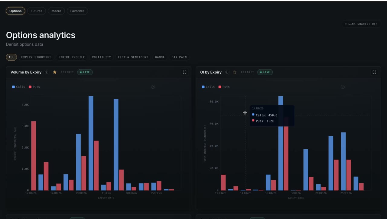
| Volume by Expiration | Trading volume per expiry | Where traders are allocating attention |
| OI by Expiration | Open interest per expiry | Where money is "trapped" by date |
| Total Volume | Aggregate daily volume with trend annotation | Overall options activity direction |
| Total OI | Aggregate open interest + 24h change | Whether positioning is growing or unwinding |
Strike Profile · 3
| Chart | What it shows | What you read |
|---|---|---|
| Volume by Strike | Calls/puts per strike + spot & max-pain markers | Which strikes are in play today |
| OI by Strike | Calls/puts per strike with per-strike aggressor side | Where positions are built and on which side |
| Gamma by Strike | Per-strike gamma exposure with spot/max-pain overlay | Where hedging pressure concentrates |
Volatility · 9
| Chart | What it shows | What you read |
|---|---|---|
| Implied Volatility (IV) | ATM IV with P25/P75 7-day percentile bands | Whether IV is rich or cheap vs recent history |
| Skew (25-delta) | Put IV minus call IV per expiry + extreme thresholds | Demand for downside vs upside protection |
| Multi-Expiry Skew | Skew curve across multiple expiries | How fear is distributed over time |
| Term Structure | ATM IV front to back with regime label | Contango vs backwardation in volatility |
| IV Term Structure | Surface-level term structure view | The full IV curve shape |
| IV/RV Spread | IV30 minus RV30 with premium/discount zone | Whether options are over- or under-priced |
| Gamma Index (GEX regime) | Dealer GEX regime — long-gamma, short-gamma or neutral | Whether the market mean-reverts or trends |
| Butterfly (25-delta) | 25-delta butterfly — wing demand vs ATM | Appetite for tail risk |
| Probability Above Strike | Lognormal P(price > strike) at current spot and IV | Market-implied odds for each strike |
Flow & Sentiment · 4
| Chart | What it shows | What you read |
|---|---|---|
| Buy/Sell Flow | Aggregated buy vs sell flow over time | Net options demand direction |
| Buy/Sell by Expiry | Buy/sell per expiry with toggleable legend | Which expiries are being accumulated |
| OI Change | 24h OI delta per strike | Where new positions are opening |
| OI Distribution | OI spread across strikes, heat-style | The overall positioning landscape |
Gamma · 2
| Chart | What it shows | What you read |
|---|---|---|
| Net Gamma by Strike (signed) | Signed net gamma per strike, color-coded | The dealer hedging map — squeeze vs stabilization zones |
| Top Gamma Levels | Top strikes by absolute gamma | Where price "magnetism" is strongest |
Max Pain · 1
| Chart | What it shows | What you read |
|---|---|---|
| Max Pain | Global max-pain price + per-expiry gamma flip levels | Where expiry "magnetism" pulls price |
Macro (FRED) · 28 series
Net Liquidity · 6
| Series | What it shows | Frequency |
|---|---|---|
| Fed Balance Sheet (WALCL) | Total Fed assets — core liquidity driver | Weekly |
| Bank Reserves | Reserves held at the Fed | Weekly |
| Reverse Repo (RRP) | Cash parked at the Fed overnight | Daily |
| Treasury General Account (TGA) | Treasury's cash balance | Daily |
| SOFR Volume | Secured funding market volume | Daily |
| M2 Money Supply | Broad money supply | Monthly |
Fed Balance Sheet minus TGA minus Reverse Repo gives a net-liquidity proxy that has historically tracked crypto risk appetite — the framework popularised by macro investors like Stan Druckenmiller.
Rates & Yields · 5
| Series | What it shows |
|---|---|
| SOFR | Secured Overnight Financing Rate |
| Fed Funds Rate | The Fed's policy rate |
| 10y Treasury Yield | Benchmark long-term yield |
| 2y Treasury Yield | Policy-sensitive short yield |
| 10y–2y Spread | Yield-curve slope — classic recession indicator |
Credit Spreads · 2
| Series | What it shows |
|---|---|
| High Yield Spread | Junk-bond risk premium — broad risk gauge |
| Investment Grade Spread | High-quality credit risk premium |
Inflation · 4
| Series | What it shows |
|---|---|
| CPI | Consumer Price Index |
| PPI | Producer Price Index |
| 5y Breakeven | 5-year inflation expectations (TIPS-derived) |
| 10y Breakeven | 10-year inflation expectations |
Labor Market · 3
| Series | What it shows |
|---|---|
| Unemployment Rate | Headline unemployment |
| Initial Jobless Claims | Weekly first-time claims |
| Non-Farm Payrolls (NFP) | Monthly job creation |
Dollar & FX · 3
| Series | What it shows |
|---|---|
| Dollar Index (DXY) | USD strength — risk-on/risk-off proxy |
| EUR/USD | Euro vs dollar |
| USD/JPY | Dollar vs yen — carry-trade barometer |
Markets · 4
| Series | What it shows |
|---|---|
| S&P 500 | Benchmark equity index |
| VIX | Equity volatility — fear gauge |
| Bitcoin (FRED) | BTC/USD monthly — independent benchmark |
| US GDP | Quarterly economic output |
How it works
Every chart reads from one streaming layer — the same data that powers the rest of the platform — so nothing is computed on the fly and nothing drifts between modules. Hot assets update every five seconds, and if one venue goes down the feed fails over across five exchanges so your screen stays live.
The READING footer under each chart is generated by the same rule engine that feeds Market Intelligence and the AI Analyst. That means the interpretation you read on a chart is the exact signal the rest of the system acts on — one source of truth, no contradictions.
Charts is the research and monitoring layer. When a footer flags something worth acting on — a CVD divergence, a short-gamma regime, an inverting curve — you move into the deep-dive modules: Order Flow for tick-level detail, Options Map for the full gamma surface, Market Intelligence for the combined verdict. Same data underneath, no switching tools.
Common questions
What charts does FOCSAL include for crypto futures?
Fifteen futures charts across five categories: Price & Volume, Open Interest, Funding & Basis, Order Flow (with CVD divergence detection) and Liquidations — all multi-venue with live streaming.
What options charts are available for BTC and ETH?
Twenty-four options charts sourced from Deribit: expiry structure, strike profile, nine volatility charts (IV, 25-delta skew, term structure, IV/RV, GEX regime, butterfly, probability above strike), flow & sentiment, signed gamma by strike, and max pain with gamma-flip levels.
Does FOCSAL show macro charts like the Fed balance sheet and yield curve?
Yes — 28 FRED series across Net Liquidity (Fed balance sheet, reserves, reverse repo, TGA, M2), rates and yields, credit spreads, inflation, labor, dollar/FX and markets including the S&P 500 and VIX.
What is a CVD divergence chart?
It compares cumulative volume delta on spot against perpetuals. When spot distributes while perps push price up, larger players may be selling into retail demand — FOCSAL flags these events automatically.
Open 67 charts on one tab
BTC futures and options charts are available on the free plan — no credit card required.
See plans