Liquidity Map — where price gets pulled and stopped
A predictive liquidity heatmap. See where liquidations already happened, where they're likely to happen next, and where the strongest magnets sit — order-book walls, real liquidations and forward estimates converged into one 2D map.
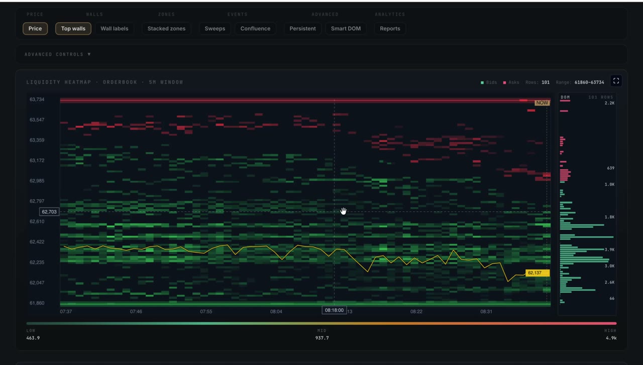
Why it exists
Price doesn't move randomly between levels — it gets pulled toward pools of liquidity and stopped at walls of resting orders. The problem is that this information is scattered: order-book depth in one place, actual liquidations in another, and the forward-looking risk zones nowhere at all.
Liquidity Map converges all three into a single heatmap. You can see the cluster sitting below at 65,800 that price keeps drifting toward, the wall above that keeps rejecting it, and how strong each one really is — so levels stop being guesses.
What you get
Four ways to read the map
| Mode | What it shows | Use it for |
|---|---|---|
| Raw | Actual reported liquidations clustered by price level | Post-event analysis — where forced sellers already flushed |
| Synthetic | Estimated future liquidation levels from open interest + leverage | Forward-looking risk — where liquidations will likely hit |
| Synthetic Heatmap | The same forward estimate as a smooth intensity gradient | Dashboard-style monitoring at a glance |
| Hybrid · default | Recent real events plus the forward estimate beyond | The most actionable single view |
The reports panel
| Report | What it tells you |
|---|---|
| Liquidity Walls | Bid and ask walls with price, USD size, density and an asymmetry read — which side dominates |
| Sweeps | Sweep events with timestamp, side, magnitude and venue, clustered when they repeat |
| Absorptions | Where aggression was absorbed at clustered levels |
| Convergence | A high-conviction chip when a wall, a sweep and an absorption all land on the same level |
Most heatmaps only show you where liquidations already happened. The synthetic mode estimates where they will likely happen if price reaches a level — turning the map from a record into a risk forecast for the positions you're holding now.
How it works
A pooled worker rebuilds the map across asset–venue pairs and timeframes, with a fast loop for the 1-minute view so it stays responsive while higher timeframes refresh in the background. A canonical bucket size keeps every asset at the same fine resolution — so an altcoin map is as readable as BTC, not a handful of coarse bars. Heatmap snapshots are compressed dramatically for delivery, keeping load times in the tens of milliseconds.
Liquidity Map and Order Flow are built to work in tandem: the map tells you where the clusters and walls are, Order Flow shows you how price interacts with them when it arrives. Click a sweep in one and jump to the same moment in the other. The same liquidity read also feeds Market Intelligence's verdict.
Open Liquidity Map on the live market
Liquidation clusters, walls and forward-looking zones — included from the Pro plan upward.
See plans