Order Flow — see who moves price, tick by tick
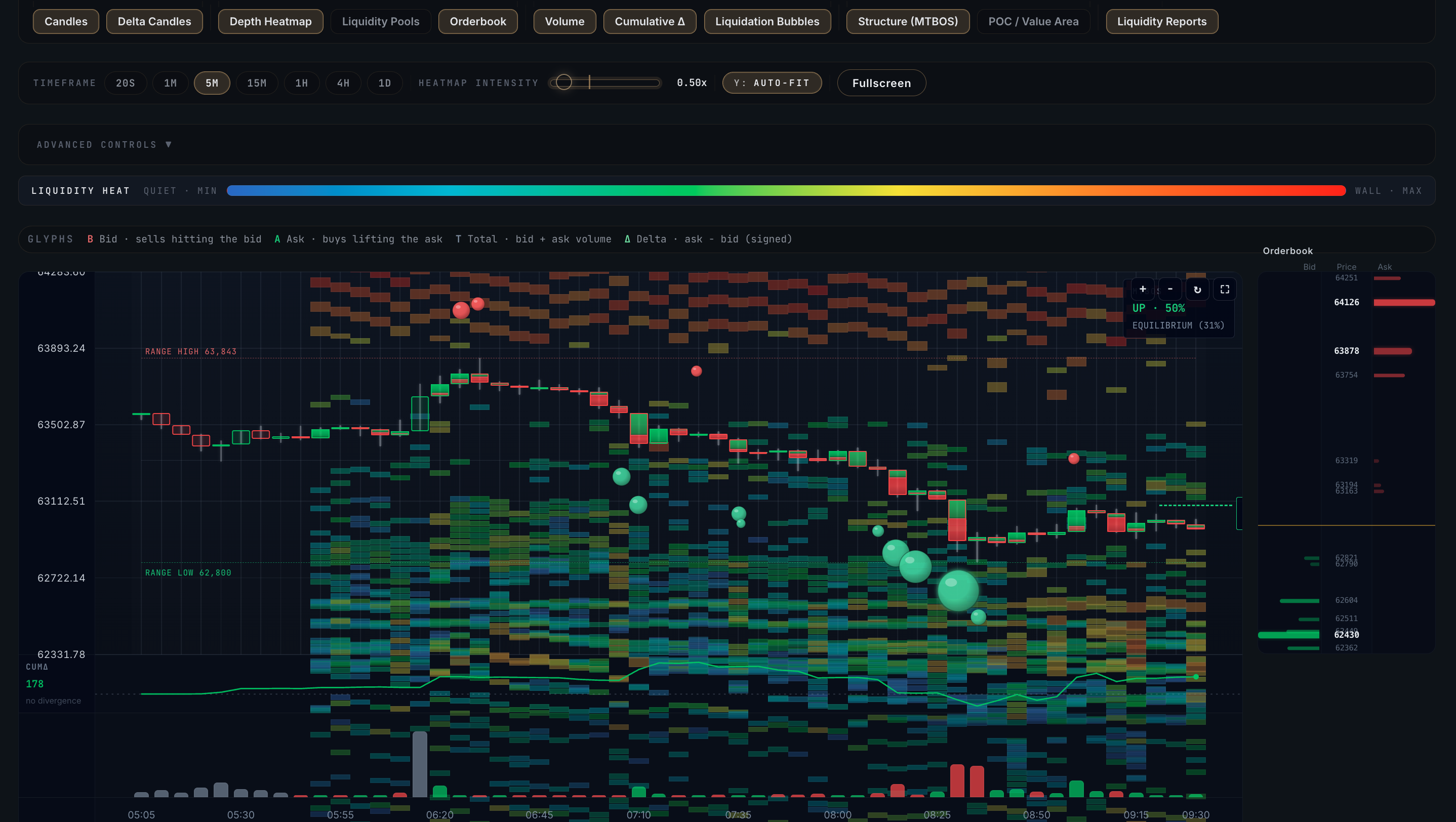
A tick-level reconstruction of order flow. A candle gives you four numbers; a footprint gives you about 180× more — buy and sell volume at every price level, delta, point of control and the absorption and sweep events that actually decide direction.
Why it exists
A normal candlestick hides almost everything. It tells you where price opened, closed, and the high and low — and nothing about how it got there or who was pushing. By the time a move shows up as a red or green candle, the information that would have told you it was coming is already gone.
Order Flow rebuilds the candle from the inside. Every bar is broken into price levels, and each level shows the aggressive buying versus selling that happened there — so you can see absorption at a low before the bounce, or a sweep through a high before the reversal, while it's happening rather than after.
What you get
The eleven layers
The footprint canvas is built from composable layers in five groups — turn on exactly what you need:
Price · 2
| Layer | What it shows |
|---|---|
| Candles | Classic OHLC per bar with bull/bear colour-coding |
| Volume Bars | Per-candle volume beneath the price |
Liquidity · 3
| Layer | What it shows |
|---|---|
| Depth Heatmap | Order-book depth projected over time, rainbow-coded from cold liquidity to hot walls — where market makers placed size |
| Liquidation Bubbles | Each liquidation as a bubble sized by USD, coloured long vs short, flagged when it lands near a cluster |
| Liquidity Pools | Forward-looking zones where a cluster may form, based on open interest and leverage |
Flow · 3
| Layer | What it shows |
|---|---|
| Footprint Cells | The core view — every candle split into price levels with buy vs sell volume, delta colouring, and per-level absorption flags (1m / 5m / 15m / 1h) |
| POC Line | Point of Control — the highest-volume level per candle, tracked as a fair-value reference |
| Delta Candles | A net-delta bar above each candle — buy minus sell, height and colour showing intent |
Structure · 2
| Layer | What it shows |
|---|---|
| Break of Structure (BOS) | Chevrons marking broken highs (uptrend confirm) or lows (downtrend confirm) |
| MSS / CHoCH | Change-of-character markers — early reversal signals, classified BOS / MSS / CHoCH |
Analytics · 1
| Layer | What it shows |
|---|---|
| Premium / Discount Overlay | Range rails marking premium and discount zones with an ATR-relative break threshold — is price expensive or cheap within its range |
Four intelligence reports
Beside the chart, four collapsible reports turn the raw tape into read-outs:
| Report | What it tells you |
|---|---|
| Liquidity | Bid vs ask walls, the nearest cluster, an asymmetry ratio, and a "pressed against wall" flag when price sits within 0.2% of a major cluster |
| Volume Profile | Per-level volume histogram with POC and value-area high/low, sortable by price or volume |
| Signals | Sweep and absorption events, with sweep clustering — four or more same-direction sweeps in five minutes collapse into a single "stop-hunt cluster" row — and a recency gradient that fades older events |
| Structure | Break alignment across six timeframes (15m to 1mo) with an overall bias verdict — strong, aligned, transitioning or mixed |
Absorption is when the aggressive side hammers a level with volume but price refuses to move — the passive side is soaking it up. Absorption at the lows is quietly bullish; at the highs, quietly bearish. Order Flow flags it automatically, at the level it happens.
How it works
A dedicated worker reads the aggregated trade stream across venues, classifies each trade by aggressor side, and buckets it by timeframe, candle and price level. Absorption is detected when aggressive volume outweighs the passive side by more than 2× yet price barely moves. The whole thing renders in the browser — a full screen of roughly sixteen thousand cells in under 300 milliseconds — with delta updates so only what changed gets sent.
Order Flow works hand in hand with Liquidity Map: the map shows you where the clusters sit, Order Flow shows you how price interacts with them — an aggressive buy absorbed at support, or a sweep that breaks it. The same sweep and structure signals feed Market Intelligence, so what you see on the tape is what the engine votes on.
Open Order Flow on the live market
Footprint, depth heatmap and intelligence reports — included from the Pro plan upward.
See plans