Pulse — the whole crypto market on one screen
The first screen you open. Seven market layers in one grid — macro, volatility, dealer positioning, funding, liquidations, institutional flow and ETF capital — read in about ten seconds, refreshed every thirty.
Why it exists
Reading the crypto market usually means opening five or six things at once — one tab for macro, another for options volatility, another for funding, another for institutional positioning — then stitching them together in your head before you do anything. By the time you have the full picture, the moment has often moved.
Pulse collapses that ritual into a single view. Instead of switching between screens to ask “what’s the market actually doing right now?”, you open one tab and the answer is already framed for you — in plain language, not raw numbers.
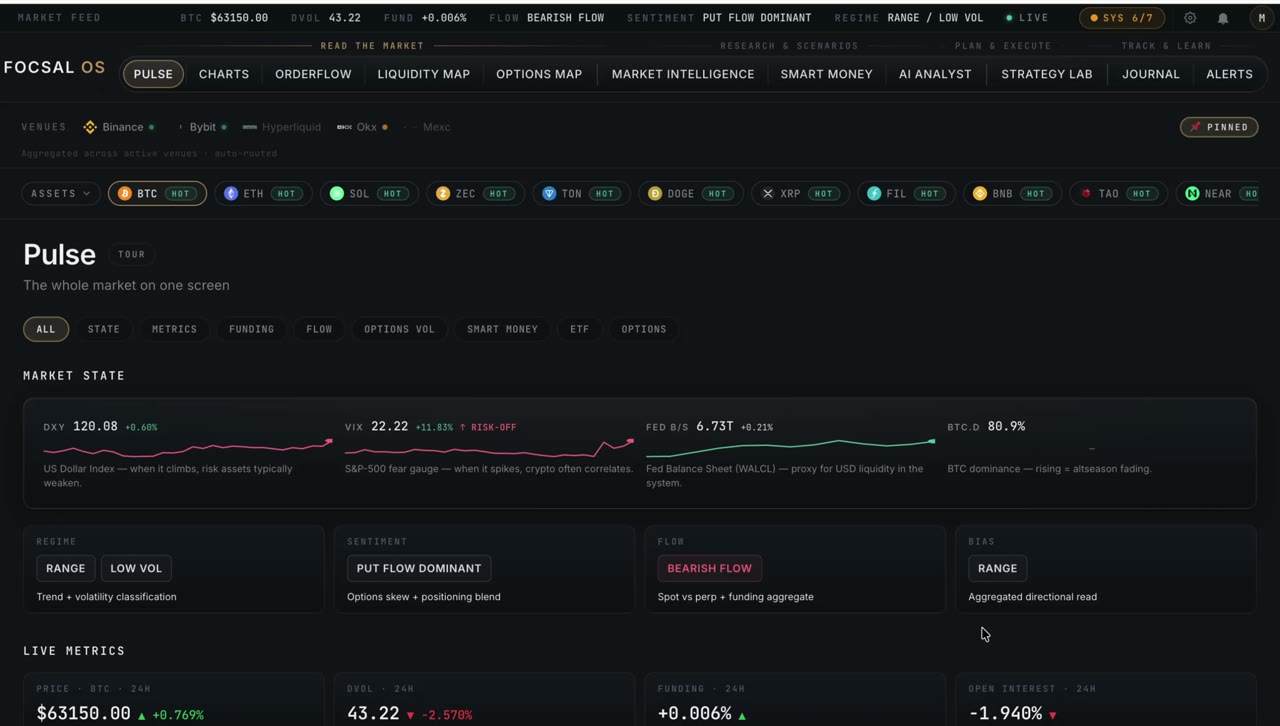
What you get
Four one-word verdict tiles set the tone the instant the page loads — deliberately interpretation, not metrics you have to decode:
Underneath them, the full picture — every layer with the concrete data behind it:
How it reads the market
Pulse layers together what professional desks watch separately. Macro context (DXY, VIX, Fed balance sheet, BTC dominance) tells you what traditional finance is doing right now. Volatility regime compares implied against 30-day realized to tell you whether options are cheap or expensive. Funding pressure across four venues shows where retail leverage is hiding — and where it diverges between exchanges.
Then the slower, heavier signals: institutional positioning from weekly CFTC reports for BTC and ETH, spot ETF flows showing where TradFi capital is allocating, and liquidation cascades that flag when forced sellers are flushing the market. Each carries a freshness indicator, so you always know how current the read is.
Every tile leads with a one-word interpretation and a short subtitle explaining what it measures. The numbers are there when you want them — but the first glance is meant to be an answer, not homework.
Pulse isn’t a standalone dashboard — it’s the framing layer for everything else. It points you where to look, then hands off to the deep-dive modules: a short-gamma read sends you into Options Map, a liquidation cluster into Liquidity Map, an institutional shift into Smart Money. Same data foundation underneath, no switching between platforms.
Open Pulse on the live market
Pulse is available on the free plan — the whole market state on one screen, no credit card required.
See plans